👍👍👍👍👍💞💟💕
Beautiful ! 💜💛💜
Beautiful
Bad ass. You are Palette Queen. How do you do it?
Another Beauty 😍😍😍💜💜
excellent awesomeness!
Wonderful Starr💜
@🌟⭐SouthernStarr⭐🌟 😘😘❤❤
@🌟⭐SouthernStarr⭐🌟 Thsnks Marie
@🌟⭐SouthernStarr⭐🌟 Thanks!
@🌟⭐SouthernStarr⭐🌟 By learning from you! I have been trying to do more of a colored chrome effects. and figure out some of your colors. but I always.
@🌟⭐SouthernStarr⭐🌟 fall back to my purples, blues and burgundies
@🌟⭐SouthernStarr⭐🌟 Thanks sweetheart
@🌟⭐SouthernStarr⭐🌟 Many thanks to you sweet Carissa
@🌟⭐SouthernStarr⭐🌟 Thanks honey
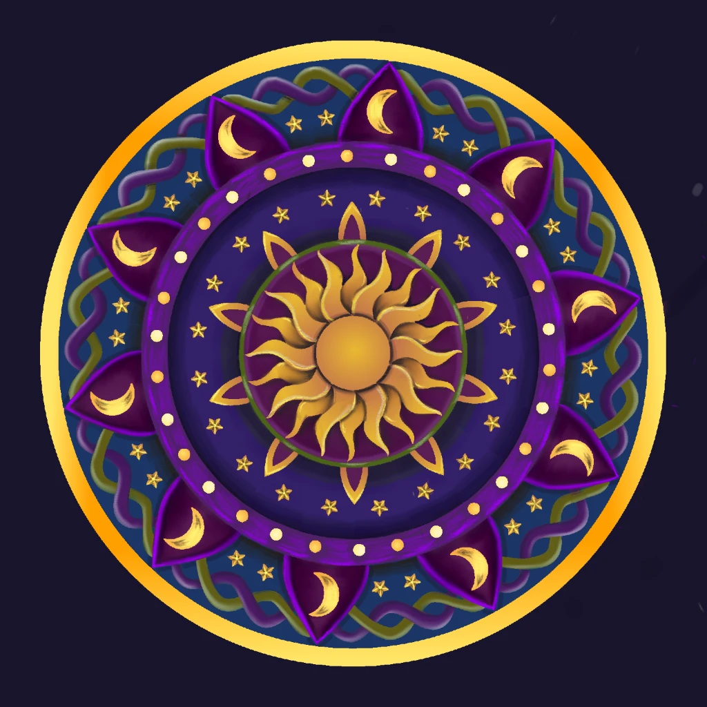
@upgraydd You're doing well. I'm sure you've probably noticed, but the key to metallics is *high contrasts*...
@upgraydd Metals, like other highly reflective surfaces, won't have the slow blended gradients found on the surfaces of other
@upgraydd , more absorbable materials. Instead, high contrasts (bright, nearly white) will sit next to, or much closer to...
@upgraydd low contrasts (dark, nearly black). Kinda like you did in those outer crescent moons.
@upgraydd The darker your low contrast, the brighter it will make your high contrasts look. And vice versa.
@Marie Hill your we South 🕊
@upgraydd So, try a quick experiment: Go back into this pic. Sample the darkest areas of those crescent moon. Then turn up that
@upgraydd darkness. Go even closer to the bottom of the color square. Be bold. Then take your pencil on middle opacity and get in
@upgraydd there with the darkness. You will see those lemon yellows look even brighter. Shinier.
@upgraydd Then, sample those lemon yellows. Crank up the brightness by moving up and to the left on the square. Do the same with
@upgraydd middle of those yellows. You will know it when you see it. It will ring true in your mind.
And, lastly, smudge it with the palette knife. A bit. Too much will blend the gradient heavily. After you've done that, give it the once
over with a white pen at its thinnest and about 75% opacity right in the center of the yellow.
Btw, those tiny gold stars are really phenomenal. I think they are my favorite part.
@🌟⭐SouthernStarr⭐🌟 I am trying to do as you say. just need some practice. Thanks for the advice. and all the compliments. as always, it means a lot
@👄Timi👄 wonderful Starr you just received a color lesson from the master. congrats. I'm going to leave you comment way into
@👄Timi👄 your gallery. plz look for it
@🌟⭐SouthernStarr⭐🌟 got it! and deleted it
@👄Timi👄 ok my friend I'm here for you if you need it
@🌟⭐SouthernStarr⭐🌟 I appreciate it honey


👍👍👍👍👍💞💟💕
Beautiful ! 💜💛💜
Beautiful
Bad ass. You are Palette Queen. How do you do it?
Another Beauty 😍😍😍💜💜
excellent awesomeness!
Wonderful Starr💜
@🌟⭐SouthernStarr⭐🌟 😘😘❤❤
@🌟⭐SouthernStarr⭐🌟 Thsnks Marie
@🌟⭐SouthernStarr⭐🌟 Thanks!
@🌟⭐SouthernStarr⭐🌟 By learning from you! I have been trying to do more of a colored chrome effects. and figure out some of your colors. but I always.
@🌟⭐SouthernStarr⭐🌟 fall back to my purples, blues and burgundies
@🌟⭐SouthernStarr⭐🌟 Thanks sweetheart
@🌟⭐SouthernStarr⭐🌟 Many thanks to you sweet Carissa
@🌟⭐SouthernStarr⭐🌟 Thanks honey
@upgraydd You're doing well. I'm sure you've probably noticed, but the key to metallics is *high contrasts*...
@upgraydd Metals, like other highly reflective surfaces, won't have the slow blended gradients found on the surfaces of other
@upgraydd , more absorbable materials. Instead, high contrasts (bright, nearly white) will sit next to, or much closer to...
@upgraydd low contrasts (dark, nearly black). Kinda like you did in those outer crescent moons.
@upgraydd The darker your low contrast, the brighter it will make your high contrasts look. And vice versa.
@Marie Hill your we South 🕊
@upgraydd So, try a quick experiment: Go back into this pic. Sample the darkest areas of those crescent moon. Then turn up that
@upgraydd darkness. Go even closer to the bottom of the color square. Be bold. Then take your pencil on middle opacity and get in
@upgraydd there with the darkness. You will see those lemon yellows look even brighter. Shinier.
@upgraydd Then, sample those lemon yellows. Crank up the brightness by moving up and to the left on the square. Do the same with
@upgraydd middle of those yellows. You will know it when you see it. It will ring true in your mind.
And, lastly, smudge it with the palette knife. A bit. Too much will blend the gradient heavily. After you've done that, give it the once
over with a white pen at its thinnest and about 75% opacity right in the center of the yellow.
Btw, those tiny gold stars are really phenomenal. I think they are my favorite part.
@🌟⭐SouthernStarr⭐🌟 I am trying to do as you say. just need some practice. Thanks for the advice. and all the compliments. as always, it means a lot
@👄Timi👄 wonderful Starr you just received a color lesson from the master. congrats. I'm going to leave you comment way into
@👄Timi👄 your gallery. plz look for it
@🌟⭐SouthernStarr⭐🌟 got it! and deleted it
@👄Timi👄 ok my friend I'm here for you if you need it
@🌟⭐SouthernStarr⭐🌟 I appreciate it honey