wow it looks real
@upgraydd Thanks. I appreciate that.
np
awesome!👏👏💖💖👍👍
beautiful ♥ ♥ ♥
awesome
super
Hey man, good job. thanks dude.
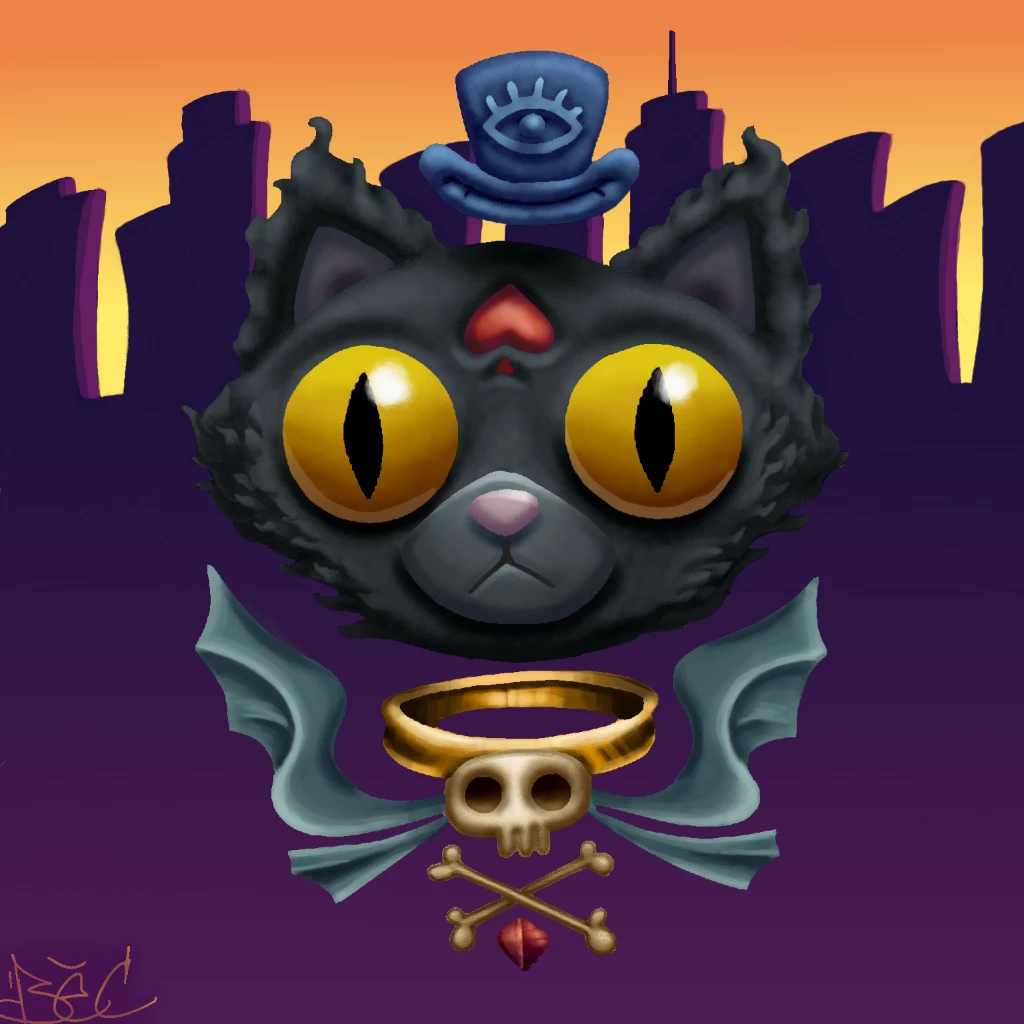
Awesome...Kinda looks like Felix the Cat🐱🐱🐱
woah..love this one!😊
This is sensational 🖼🎨👍👏
awesome ❤
Awesome 👌🏻
***Thanks very much everyone. I love each and every comment. This vehicle runs on praise. So, thanks!***
love it...eyes are WOW...GREAT job Brian💦😄😊💫
amazing as always
Awesome!
Just look at that Skull ring below the cat,,,,, Looks very very Realistic.. I really appreciate your artwork... I really love your artworks
☁😘😘☁😘😘☁ 😘😘😘😘😘😘😘 😘😘😘😘😘😘😘 ☁😘😘😘😘😘☁ ☁☁😘😘😘☁☁ ☁☁☁😘☁☁☁
génial 👍👏🎨🏅🏆😍
amazing 😍😍👍
nice awesome!😀
OMG! THOSE EYES!!👁👁 Staring into my soul... awesome job hun 😍🤩
@🍷🍕ISITA-J🍕🍷 Yup.. I am totally agree with U my dear...!
OMG ❤️❤️❤️❤️😍👍
***Thanks again, everyone. I have the best fans and followers. THANKS SO SO MUCH***
Meaning of the word....love the eyes
I am sorry upgraydd I am copy this pic but your painting is excellent my painting is fair you see my page I hope you like it....
@upgraydd MORE MEANING OF THE WORD!! YAAAAAAAAA
@upgraydd Is okay. I like your painting. 😊
@Uruza khan thank you so much brother
very nice! how do you do the gold colors and textures? I have trouble making it look realistic and not to shiny or dull lol
@upgraydd This is a question I get asked often. I will likely do a new tutorial sometime in Jan. Here are the basics:
Essentially, metallics come down to one thing: high contrasts. Think of metallic surfaces as any other material - except instead of more
@upgraydd muted shadows and highlights, you will use heavy ones towards the very top and bottom of the 'color square'.
@upgraydd You'll have very near to black basically right next to vibrant, saturated color, like in the top right corner of the square.
@upgraydd With other materials like rock, wood, sand, skin, etc., the gradient from shadow to highlight is gradual and spread out.
@upgraydd With metallics (and mirrors, glass, plastic to an extent), the gradients from shadows to highlights are quick, and sometimes
@upgraydd barely exist at all. Like, as you can see on the ring, bright lemon yellow/light peach lines are practically right next to
@upgraydd very dark brown, almost black. The gradient there between the two colors is super thin, practically non existent.
@upgraydd Hopefully I'm making some sense. References are helpful, too. Find some gold renderings online you like and try duplicating
@upgraydd them. I'll get that tutorial cranked out by mid-January.
man those eye just POP out!


wow it looks real
@upgraydd Thanks. I appreciate that.
np
awesome!👏👏💖💖👍👍
beautiful ♥ ♥ ♥
awesome
super
Hey man, good job. thanks dude.
Awesome...Kinda looks like Felix the Cat🐱🐱🐱
woah..love this one!😊
This is sensational 🖼🎨👍👏
awesome ❤
Awesome 👌🏻
***Thanks very much everyone. I love each and every comment. This vehicle runs on praise. So, thanks!***
love it...eyes are WOW...GREAT job Brian💦😄😊💫
amazing as always
Awesome!
Just look at that Skull ring below the cat,,,,, Looks very very Realistic.. I really appreciate your artwork... I really love your artworks
☁😘😘☁😘😘☁ 😘😘😘😘😘😘😘 😘😘😘😘😘😘😘 ☁😘😘😘😘😘☁ ☁☁😘😘😘☁☁ ☁☁☁😘☁☁☁
génial 👍👏🎨🏅🏆😍
amazing 😍😍👍
nice awesome!😀
OMG! THOSE EYES!!👁👁 Staring into my soul... awesome job hun 😍🤩
@🍷🍕ISITA-J🍕🍷 Yup.. I am totally agree with U my dear...!
OMG ❤️❤️❤️❤️😍👍
***Thanks again, everyone. I have the best fans and followers. THANKS SO SO MUCH***
Meaning of the word....love the eyes
I am sorry upgraydd I am copy this pic but your painting is excellent my painting is fair you see my page I hope you like it....
@upgraydd MORE MEANING OF THE WORD!! YAAAAAAAAA
@upgraydd Is okay. I like your painting. 😊
@Uruza khan thank you so much brother
very nice! how do you do the gold colors and textures? I have trouble making it look realistic and not to shiny or dull lol
@upgraydd This is a question I get asked often. I will likely do a new tutorial sometime in Jan. Here are the basics:
Essentially, metallics come down to one thing: high contrasts. Think of metallic surfaces as any other material - except instead of more
@upgraydd muted shadows and highlights, you will use heavy ones towards the very top and bottom of the 'color square'.
@upgraydd You'll have very near to black basically right next to vibrant, saturated color, like in the top right corner of the square.
@upgraydd With other materials like rock, wood, sand, skin, etc., the gradient from shadow to highlight is gradual and spread out.
@upgraydd With metallics (and mirrors, glass, plastic to an extent), the gradients from shadows to highlights are quick, and sometimes
@upgraydd barely exist at all. Like, as you can see on the ring, bright lemon yellow/light peach lines are practically right next to
@upgraydd very dark brown, almost black. The gradient there between the two colors is super thin, practically non existent.
@upgraydd Hopefully I'm making some sense. References are helpful, too. Find some gold renderings online you like and try duplicating
@upgraydd them. I'll get that tutorial cranked out by mid-January.
man those eye just POP out!